No One Is Donating
When Mongabay was first established as a not-for-profit, it focused primarily on raising money from foundations. Recently, their strategy opened up to include individual donors. While the Mongabay donation page had always existed, it lead to only a few donations. I was brought in to see if a change in design could improve the number of donations the not-for-profit received.
Redesign The Look & Flow To Increase Engagement & Conversion Rate
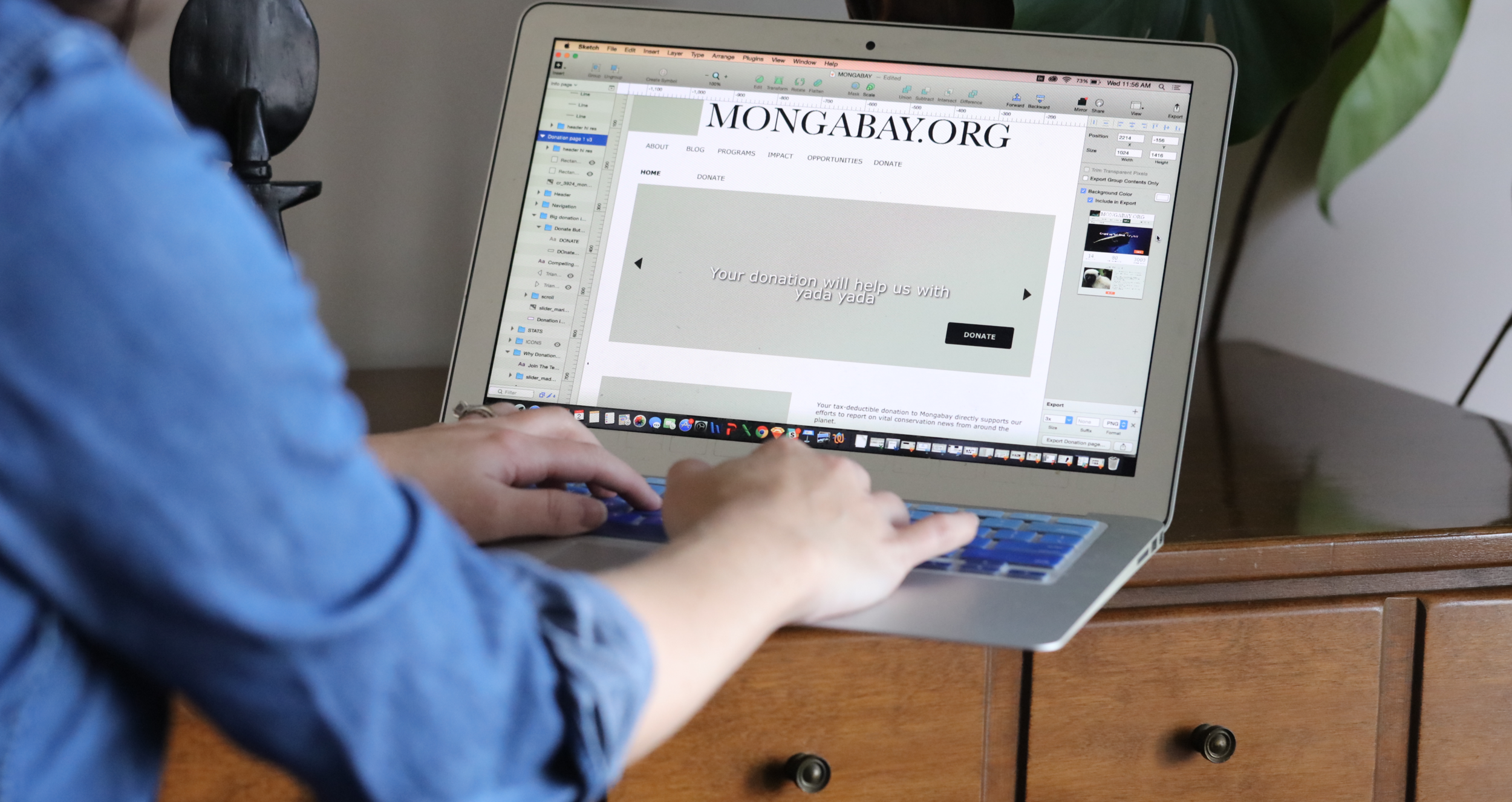
The original donation process started with a text heavy page and a difficult to find donation button. If a user clicked on the donation button it took you off the website to PayPal to make the payment. As part of the redesign, I took advantage of the vast library of nature photographs on the website to make the pages more visually pleasing, reworked the copy to make calls to action and reasons to donate more clear and then added a simple single form page for payments.
Before
After
Start With The Numbers
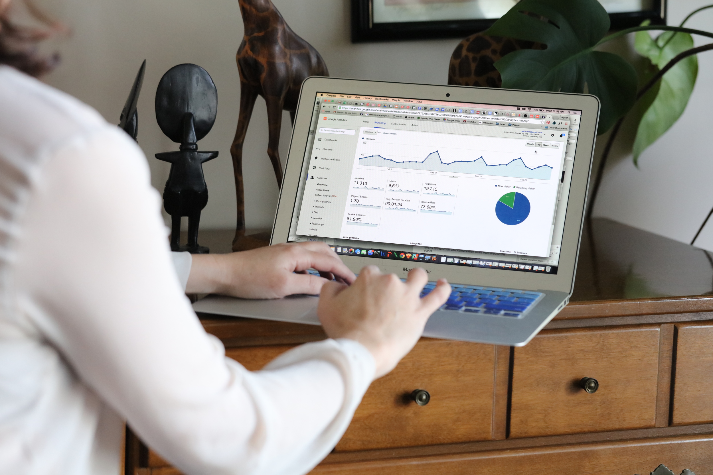
Since the page was not being built from scratch, I started my process by looking at Google Analytics to determine where visitors were dropping off in the donation flow. I was also able to see that a large percentage of the traffic was coming from mobile devices.
Sketch, Test, Iterate
I knew I wanted to make the flow as simple as possible, highlight what makes the not-for-profit great with key bullet points so it would be easily scannable and take advantage of the wealth of beautiful nature photos that Mongabay has produced. I took my ideas and tested them on visitors to the news site and then refined the designs off of their feedback.
After testing hand drawn wireframes of various styles and flows, I settled on a system that would start with a visually compelling information page, followed by s single form and ending with a thank you/conformation screen where people could add testimonials, share their donation on social media and click on recent articles about the environment.
My final deliverables were high resolution wireframes for both mobile and desktop. Several different versions have been made, testing varied language and pictures. At this point in the process, the flow is set but the visual design is being A/B Tested. Here is a sample of a few wireframes.


